Xiamen, China (January 18th, 2022)-Today, Milesight unveiled a new logo that culminates determination and energetic commitment towards AIoT era. In 2020, by company merger, Milesight integrated resources into one to become a more powerful AIoT solution provider.
Now, with a fresh look, Milesight can demonstrate itself in a clearer and better way. We’ve sat down with Emmar ZHANG, Milesight Design & Creative Manager, to discuss the design philosophy and the stories in the creation.

![]() Milesight is well-known for offering video surveillance solution and smart IoT solution among customers worldwide. So why is Milesight doing this now?
Milesight is well-known for offering video surveillance solution and smart IoT solution among customers worldwide. So why is Milesight doing this now?
We created the new VI, not because we want to change who we are;but, to reinforce what Milesight stands for. At Milesight, we want our customers to always have a “wow moment” every time they enjoy our products and solutions. The reality could be hard sometimes, but we are always looking at the starry sky and never stop trying.
So, we infused these inner spirit and commitment into the new logo. This logo, in addition to refreshing the brand image, is also a signal that we set sail for a new chapter, traversing the infinite AIoT era and breaking limits along the way.
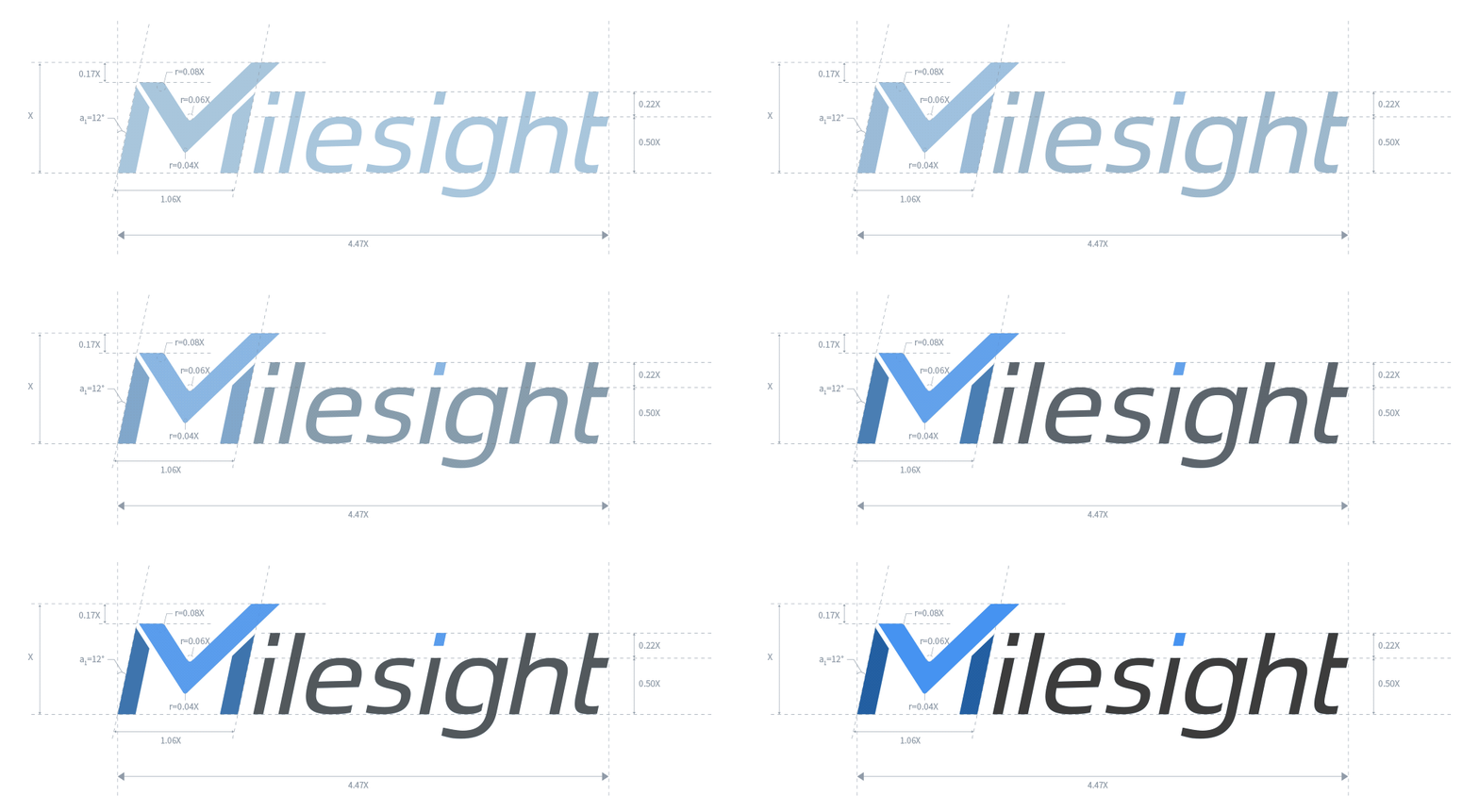 The animated version of the new Milesight logo and SVG released on January 18th, 2022.
![]() The character "M" is quite unique and distinguished. Can you talk more about what message this new logo design is sending to the market?
The character "M" is quite unique and distinguished. Can you talk more about what message this new logo design is sending to the market?
Sure. Even though we have presented multidimensional AIoT solution, we believe there are more to explore regarding the AIoT solution. The concept of AIoT, the combination of AI and IoT may still new to many customers. But based on our customers feedbacks and our experience, it does the trick to make everyday life smarter and better. You can see Milesight, starting from one product to comprehensive AIoT solution, has always kept and will continue to explore the frontier of intelligent interconnectivity.
So, you can see the new “M” is rising-upward, soaring into infinite space. It represents Milesight's firm belief to become an enterprise with innovation, energy and opening up immense possibilities to the globe. Marvelous, mighty and more mature.

Also, we are trying to deliver our right "M" sense to the users worldwide. The fonts that go with the logo are shaped as smooth and stable. It represents Milesight's vision of initiating reliable, fruitful and flexible products and services for the industries.
![]() As SVG shows, the angle of “M” is strictly stipulated in 12-degree. What led to the decision to go with this specific angle?
As SVG shows, the angle of “M” is strictly stipulated in 12-degree. What led to the decision to go with this specific angle?
It strikes a pose we refer as the “M” style. The 12-degree-angle in the logo is closely associated with Milesight's innovation abilities, that is, continuous and future-oriented. As 12 is the number of the months in a year, it stands for the time when new ideas and brilliant concepts for efficient development come out all around.
![]() The colors are different from the previous ones, especially the “M”. What was the thought process when deciding what color you wanted to standout for Milesight?
The colors are different from the previous ones, especially the “M”. What was the thought process when deciding what color you wanted to standout for Milesight?
Actually, we call it Milesight Sky Blue, Milesight Royal Blue and Milesight Iron Grey respectfully.
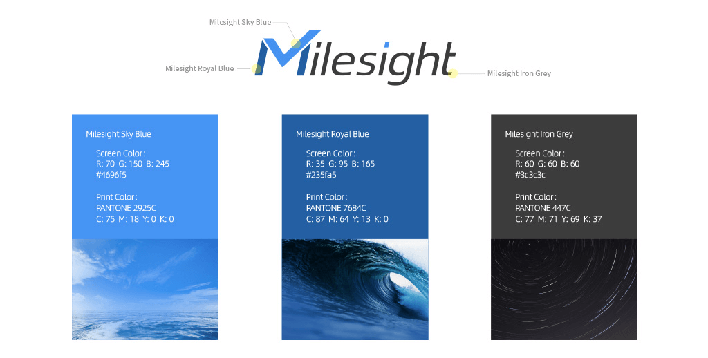
The sky-blue M symbolizes the most essential and exploratory connection with the world. The most inspiring and powerful color also boils down to the same basic principles of the company culture, of which to build up mutual-trust partner relationship, to offer stable, secure, and scalable services, and to create a more connected world.
![]() We’ve noticed an interesting graphic on your marketing materials. Is it part of the new VI? What’s your suggestion on the new logo application?
We’ve noticed an interesting graphic on your marketing materials. Is it part of the new VI? What’s your suggestion on the new logo application?
Yes, it is. When it comes to the application, we tried our best to demonstrate Milesight as straightforward and outstanding as possible. Also, in order to provide a consistent and unified brand image in different media release, our team design supporting graphics, which are derived from the standard logo, serving to supply, strengthen and enrich brand identification.
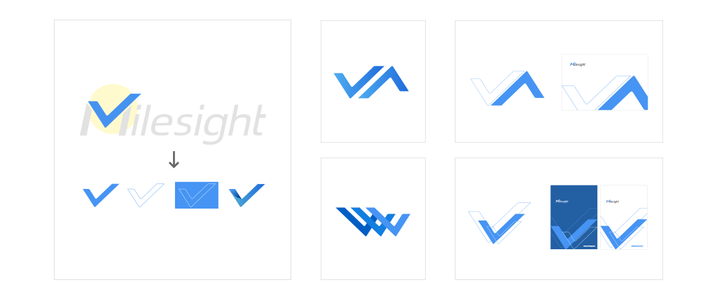
The supporting graphic represents Milesight's firm belief to become an enterprise with creativity, passion and opening up immense possibilities to the globe. Marvelous, mighty and more mature.
![]() What was your reaction and how were you feeling when the new logo finally made its debut today?
What was your reaction and how were you feeling when the new logo finally made its debut today?
As a designer, it is the happiest and most fulfilling moment when your design applied in materials and recognized by consumers everywhere. I can still remember how excited and thrilled we were on the day we moved into our new headquarters, where the new logo shone so perfectly on it. It's like a marching call for a new journey of exploring infinite possibilities in AIoT era. We hope to bring better designs and smarter AIoT solutions to everyone in the future.
About Milesight IoT
At Milesight IoT, we are passionate about the connectivity of “things” to the cloud. We leverage the value of the top trending technologies that transform the world we live in and are committed to our partners who share the same passion. We believe that the complexity of data collection, storage, and retrieval can be simplified into the Cloud-intelligence. Our development and distribution of these appliances and services demonstrates our commitment to digital transformation and continues to deliver compelling connectivity for the IoT world. For more information, please visit www.milesight-iot.com.


